Contract Work · 2015
Gem
A mobile app for users to rate and recommend local restaurants to their friends — and the brand identity and concept screens I built for it.
Overview
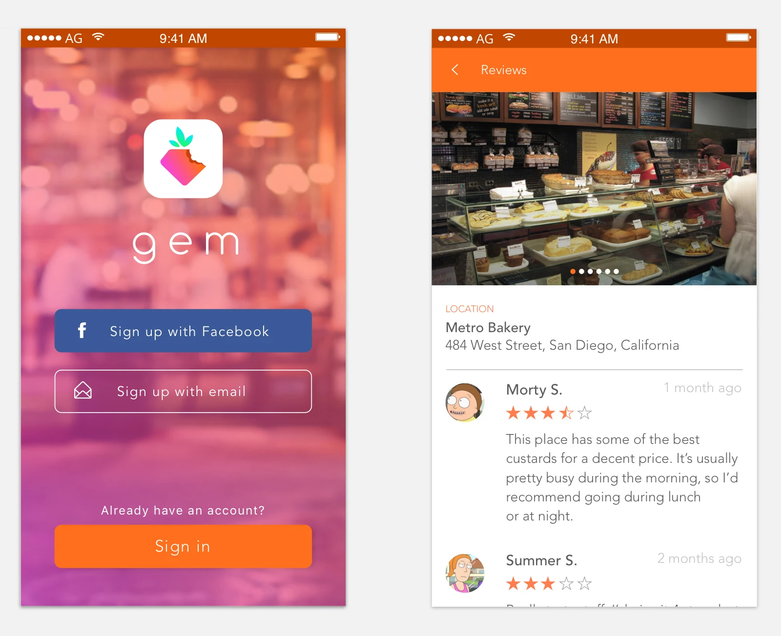
The client needed help designing a logo, brand assets, and some concept screens to be handed off to developers. Key features of the app include allowing users to rate local restaurants, view activity of their friends, and explore nearby restaurants.
Branding
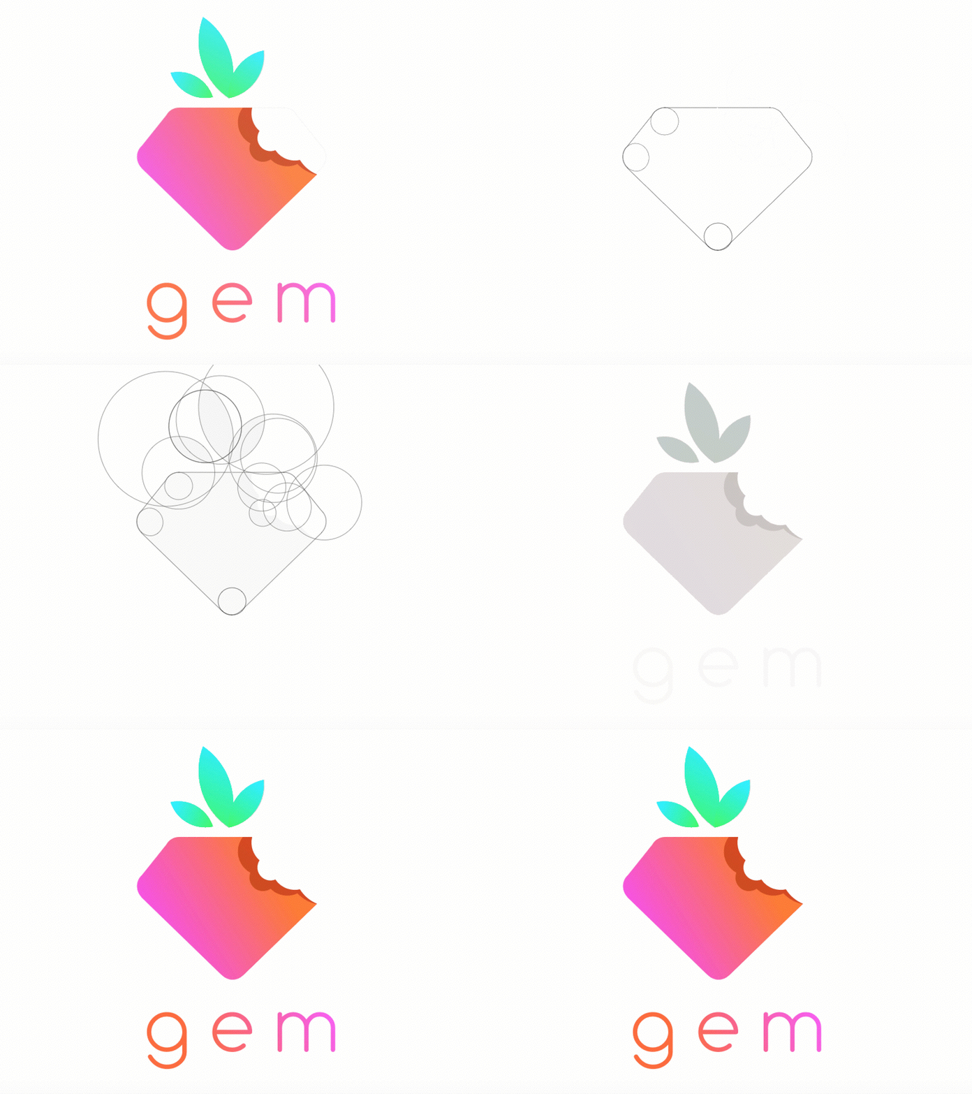
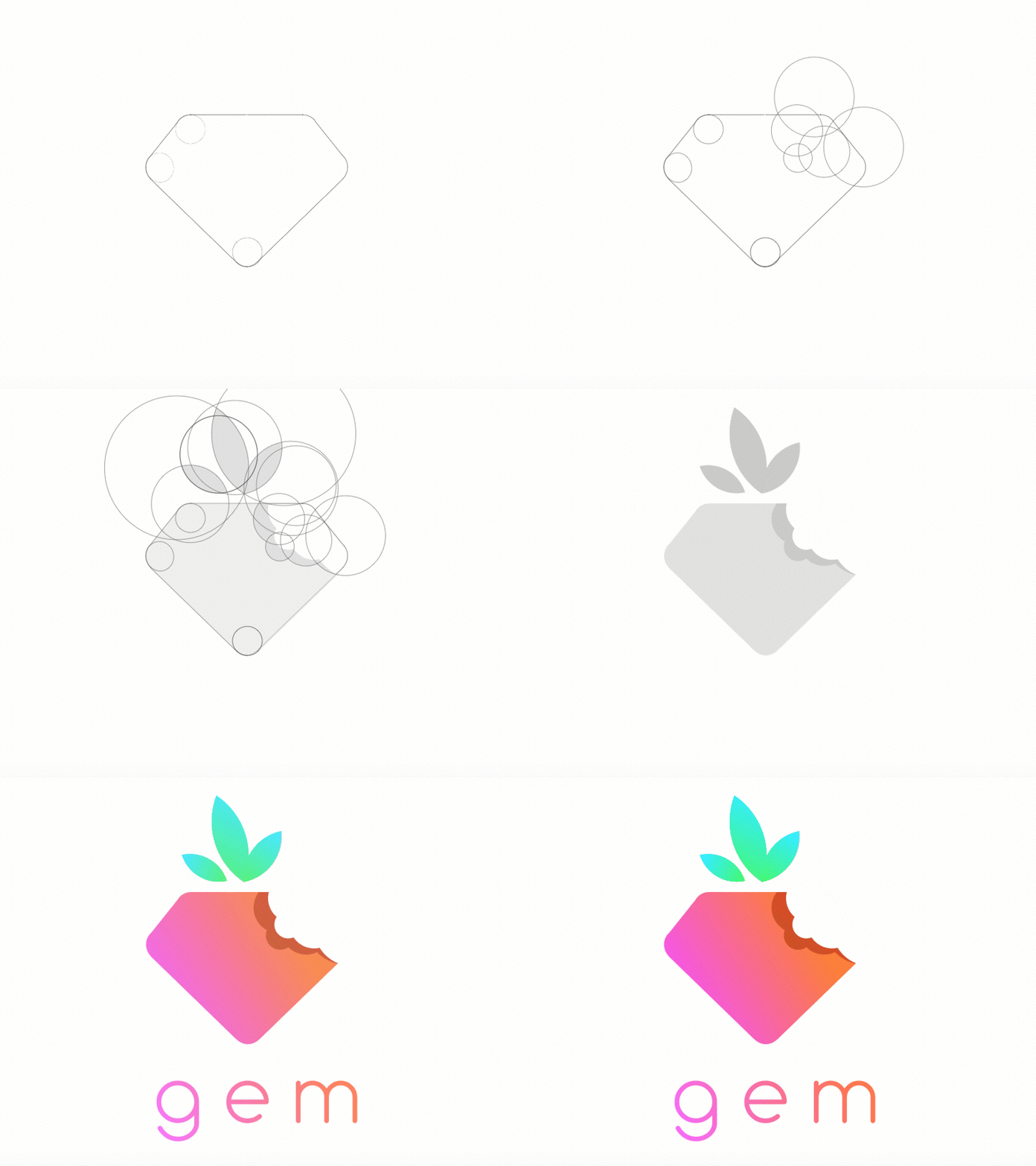
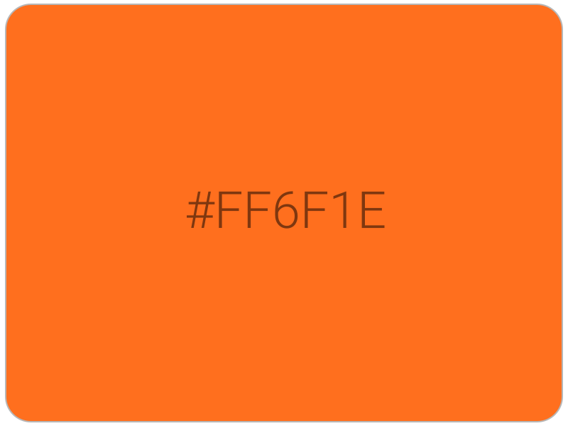
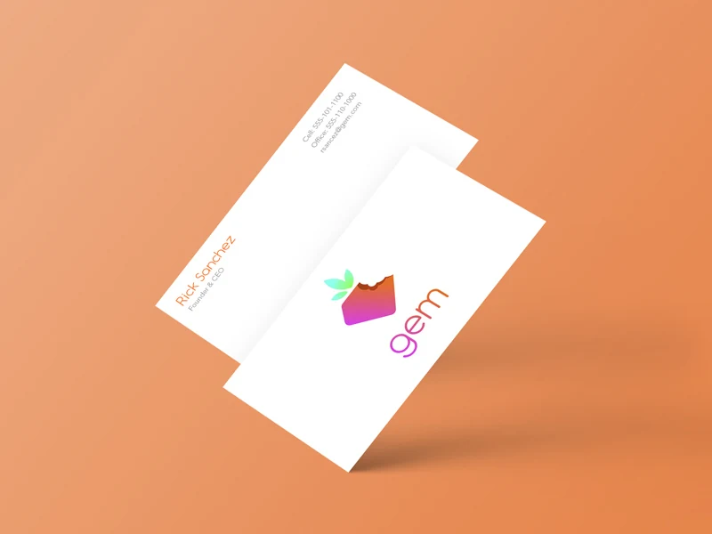
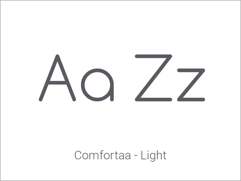
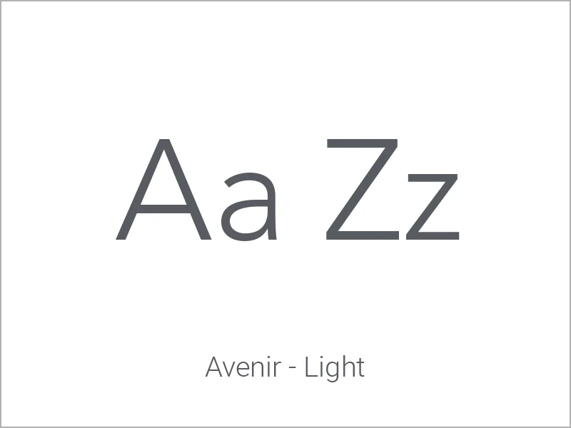
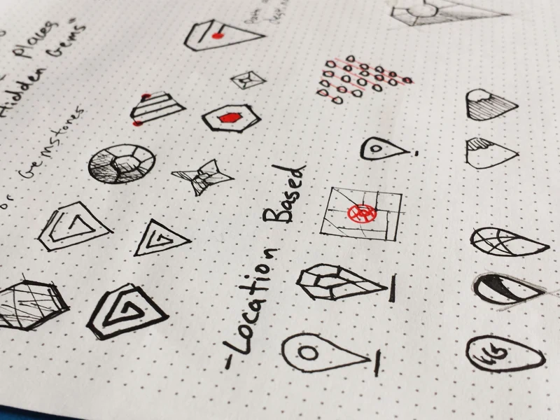
I wanted to give the logo a modern and recognizable appearance while maintaining relevancy to the idea of a "dining/food app". The bright and colorful logo, clean typography, and strawberry-shaped design communicates such ideas.
Initial Concepts
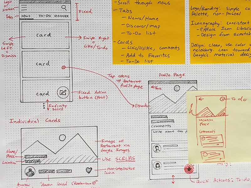
Sketching always helps with rapid prototyping for both the logo and screen designs. This helps map out key interactions such as tapping, swiping, and navigating.
Designs
The overall structure of the app is simple: a news feed of recent activity from friends (displayed as a simple list with key meta-data), a list of saved/interested locations that the user wishes to explore in their own time, and a list of nearby locations. Key interactions include tapping to reveal more information about the restaurant, including comments and ratings, and swiping on cards to dismiss or add to the "interested" list.
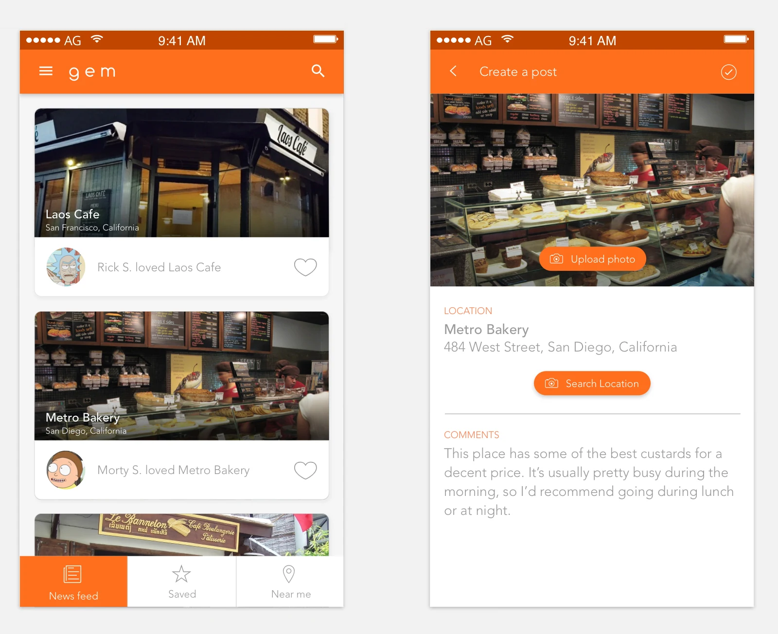
The strawberry-shaped mark isn't just a logo — its color and silhouette carry through the app itself, from the icon on the sign-up screen to the cards in the news feed, tying every screen back to the idea of food and discovery.
Design rationale