Contract Work · 2017
Pickr Uppr
The ultimate sporting app — a matchmaking app for finding local sporting vendors and teammates, and the brand identity and mobile UX I designed for it.
Overview
Pickr Uppr is a matchmaking app for users to find local sporting vendors and teammates. The client conceived of the idea when he couldn't solve the problem of not being able to find enough people to play a soccer game.
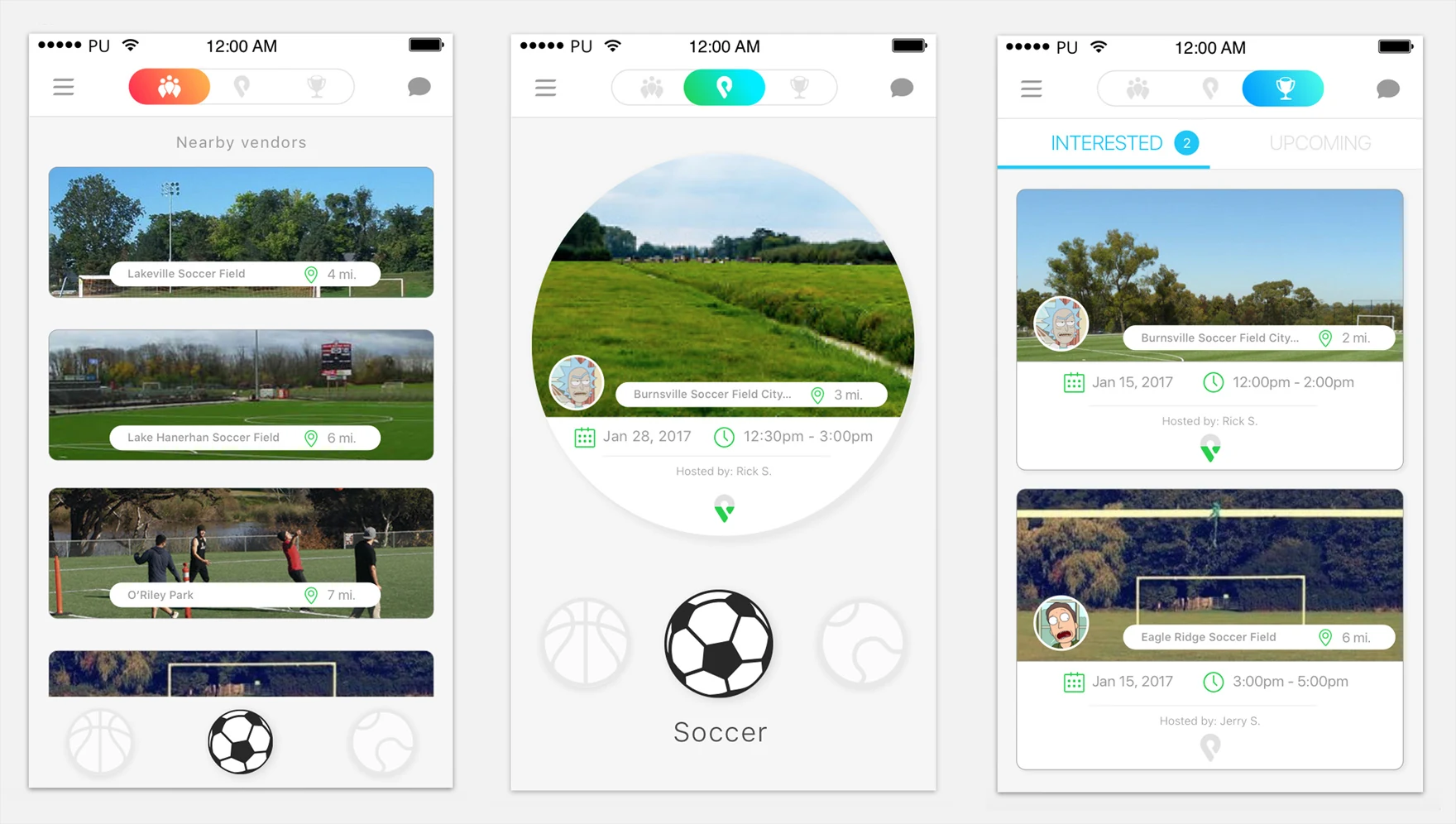
The core features include booking a date and time for sporting vendors, matchmaking players based on skill level, a variety of sports to choose from, geo-location, and performance analytics.
Branding
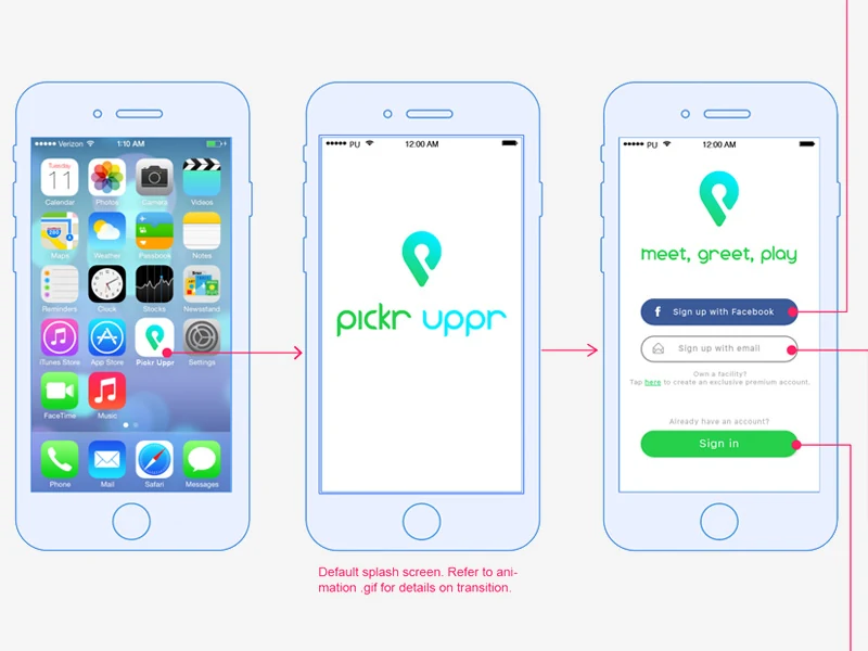
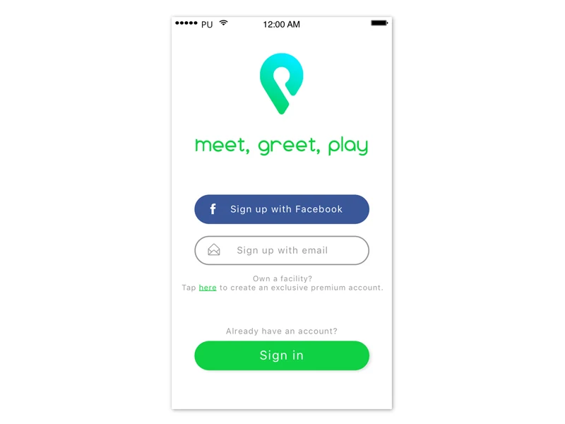
The logo was designed to look similar to a GPS locator and the letter "P" — it's simple, clean, and relevant. The color palette was chosen to be bright, modern, and reminiscent of an outdoor environment.
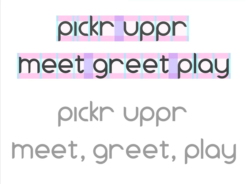
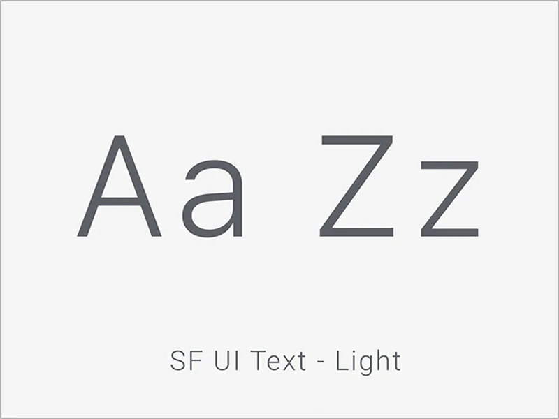
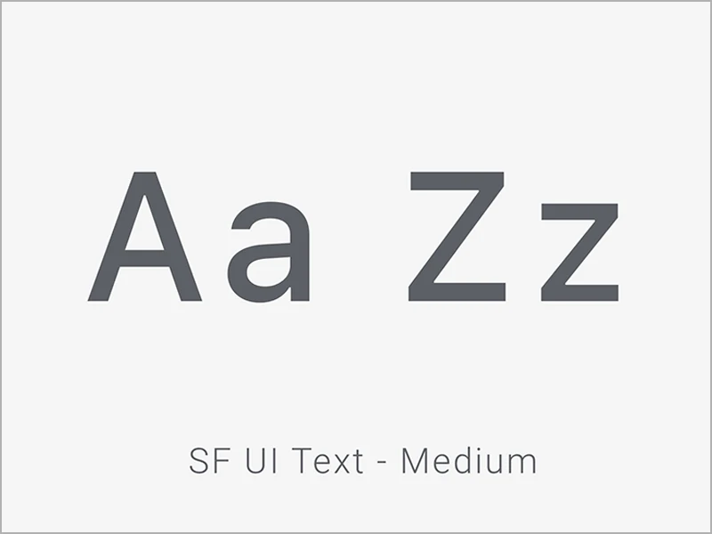
A clean, sans-serif font is used to top off the branding guidelines, in addition to some custom font.
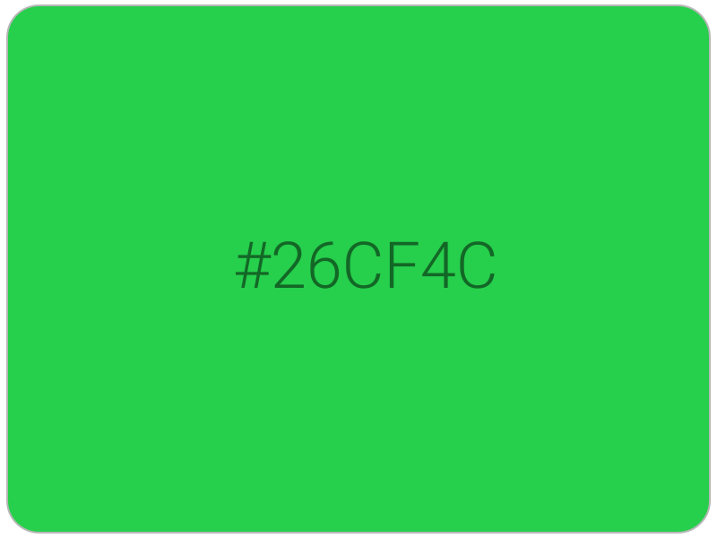
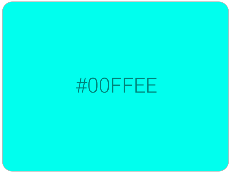
The pin-shaped mark does double duty as both logo and UI element — the same locator silhouette reappears as the geo-location icon inside the app, so the brand shows up at the exact moment a user is finding a field near them, not just on the splash screen.
Design rationale
Designs
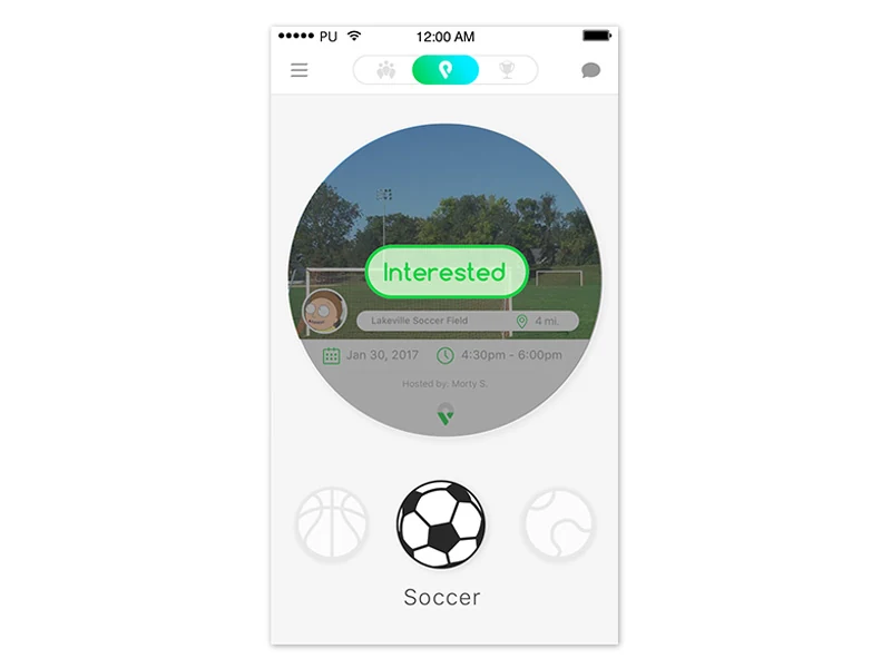
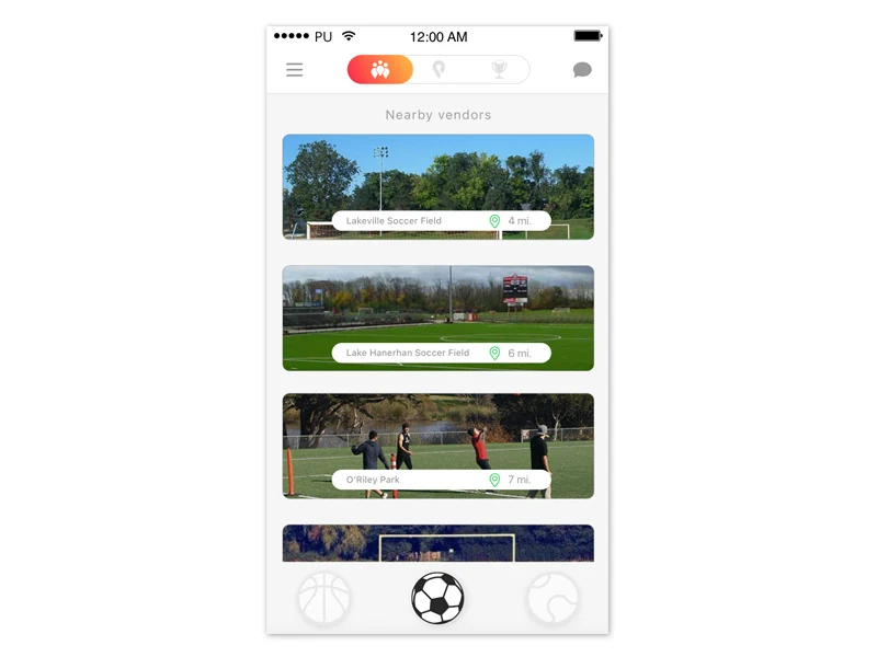
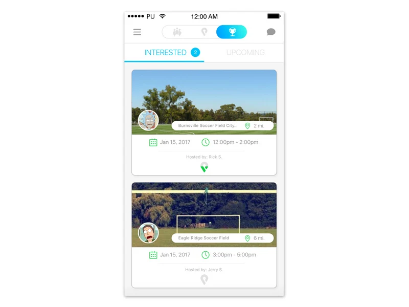
The overall structure of the app includes a stacked-card interaction, calendar functionality, and organized lists of locations. Color and images were used strategically to contrast the white background and draw users' attention to important features.
One of the challenges we faced was designing within a circular card, which limited some horizontal real estate available. Limiting the amount of meta-data and managing font size helped greatly.
Microinteractions
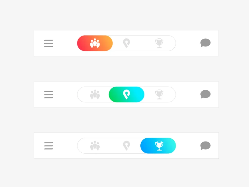
I had the opportunity to focus in on the more minute details, namely, with animations and transitions throughout the app. The key was to use meaningful animations that communicated to the user the result of their actions or guide their attention appropriately.
We had to be careful to not add too much animation as that would make the design overbearing and sloppy.
Every transition here was scoped to a single job: confirm a swipe, reveal a booking, flip a card. Restraint was the design decision — motion that explains an action reads as polish, motion that's just there for show reads as noise.
Design rationale